McCay Tool and Engineering
McCay Tool and Engineering is a St. Louis-based manufacturer of aerospace components and is an industry leader for precision machined parts. Since their post-WWII inception, McCay Tool and Engineering has become a distinguished brand for aerospace and defense agencies nationwide. Major clients include giants like Boeing and Lockheed Martin as well as the United States Federal government and those of allied nations.
Challenge
Though serviceable to most degrees, the McCay Tool and Engineering website left much to be desired in terms of design, content, and user experience. It was not designed with a “mobile first” mentality as users often called the company headquarters with questions a more robust site could have answered. McCay Tool and Engineering deserved a site that accurately reflected their position as a world leader in precision aerospace technology. And what they had simply wasn’t cutting it. They needed the help of a manufacturing marketing agency. Enter: Timmermann Group.
Takeaways
When embarking on a website redesign, you shouldn’t be asking when it will be “done”. Your site’s launch date should be an exciting milestone, and worth celebrating, but don’t think of it as a “finish line”. In the case of McCay Tool and Engineering, we are proud of the site that we were able to deliver, but we know it is just a launching pad to what it can be. By reevaluating and broadening our sitemap, building out new pages, and laying claim to valuable SEO opportunities from the start, the client is able to produce more relevant and robust content, targeting specific audiences, for years to come. There is ALWAYS an opportunity to improve and grow your site. Your website should be a living, breathing component designed to complement your marketing and sales efforts. You should always be adding to it, tweaking it, revising it, and making it a stronger resource for your company, your brand, and your customers.
How TG Helped
We knew immediately that this website required far more than a tune up and fresh coat of paint, as it were. Even users who put up with the poor design and mobile hindrances would be hard pressed to find the information they often needed; it simply didn’t exist. Their website needed to tell the McCay Tool and Engineering story and reinforce their status as a leader in aerospace manufacturing.
- Website Design
- Improved UX/UI
- Photography
Website Design
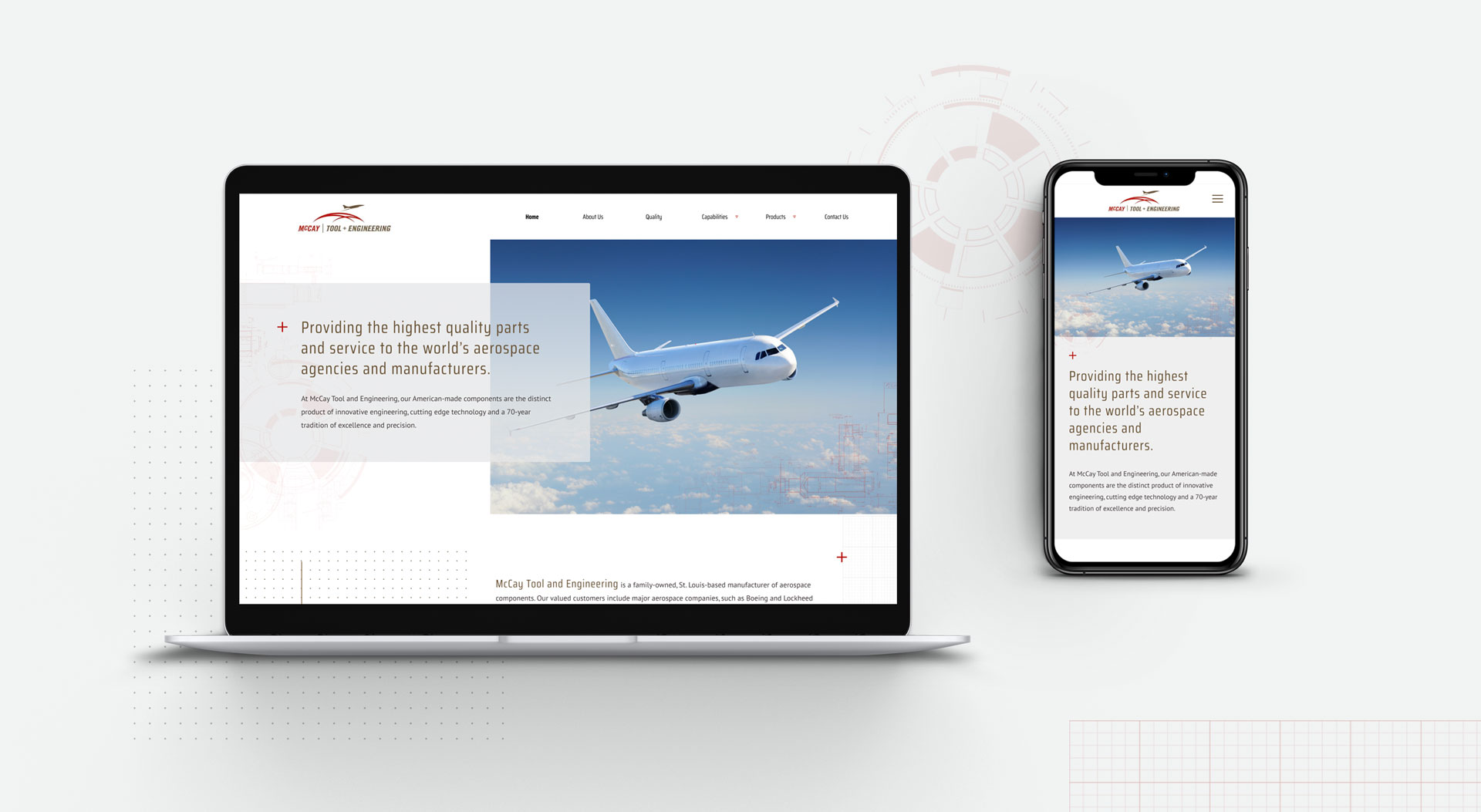
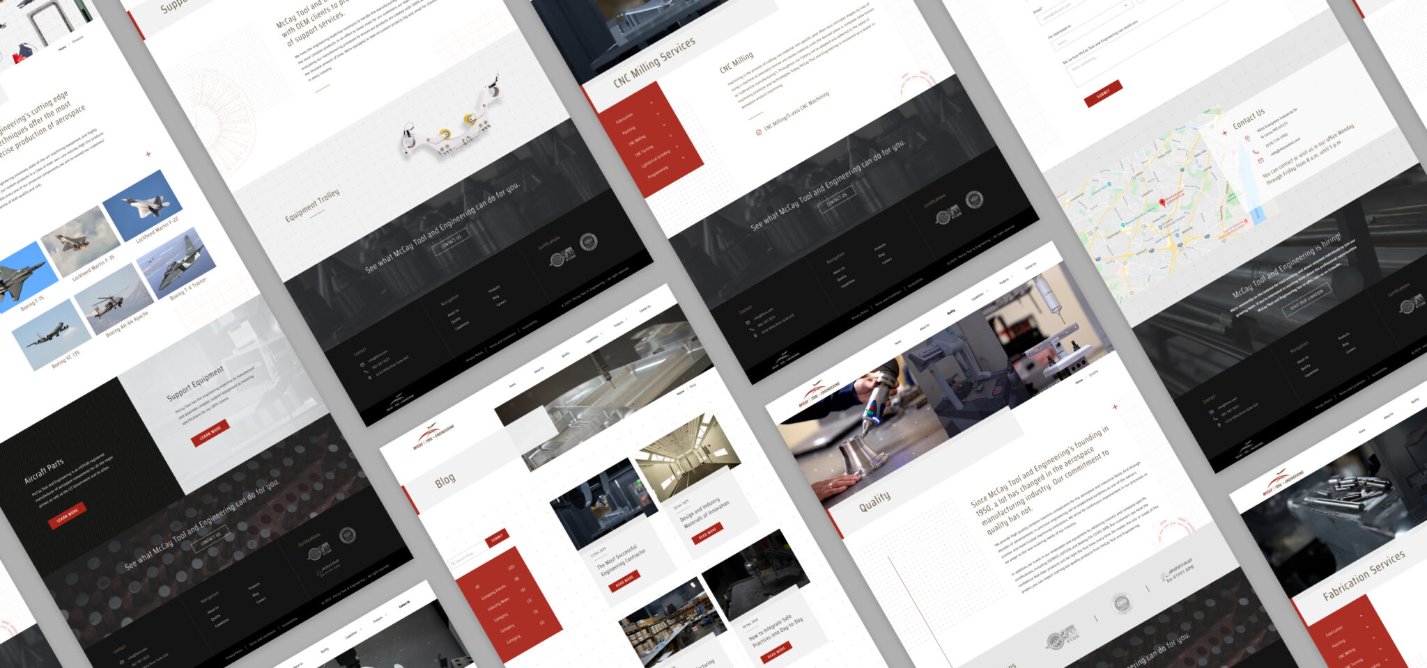
The design of the previous website looked dated, a little amateurish, and left plenty of room for improvement. While it wasn’t necessary to undergo a complete rebranding procedure, it was imperative that the new design accented their brand and told the story of what they represent. We needed the site to be just as unique and impactful as the company itself. We needed a way to stand out from the competition and appeal to a variety of potential aerospace manufacturing clients.
Improved UX/UI
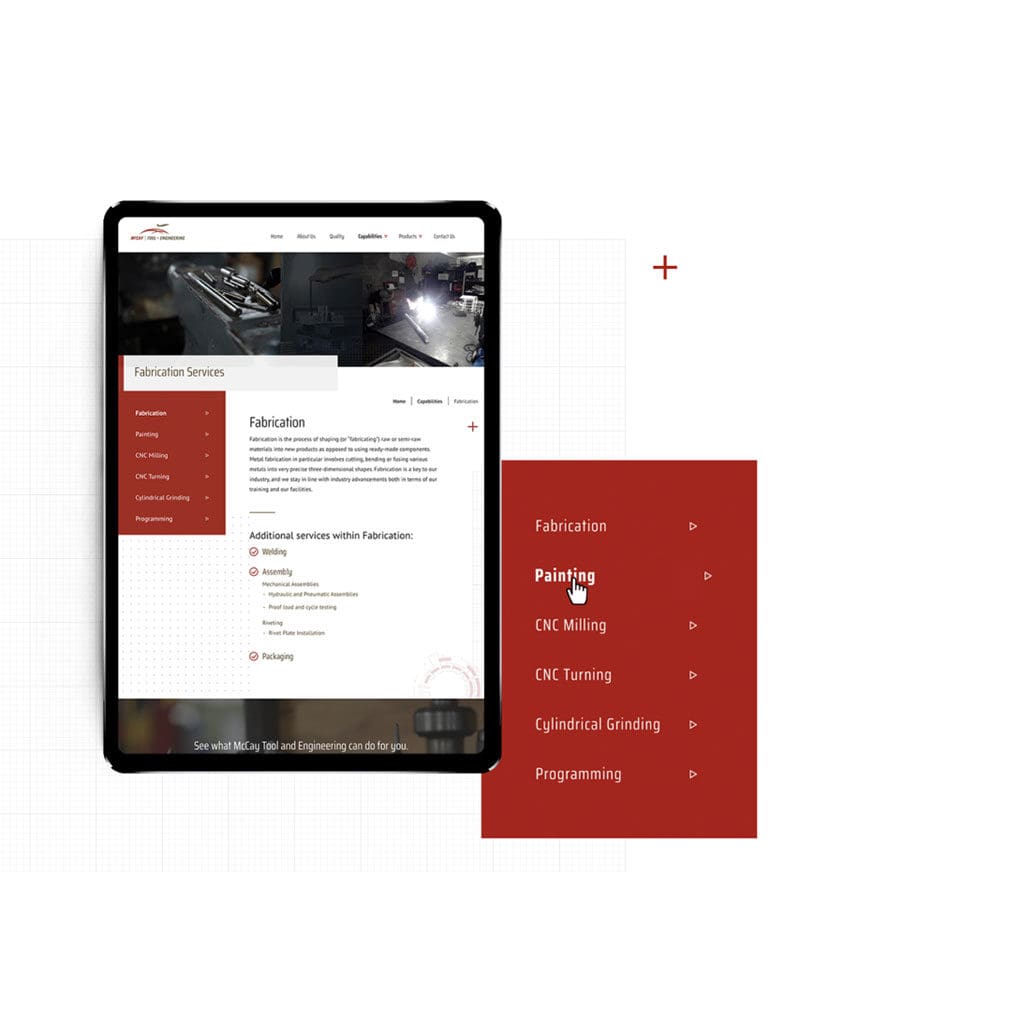
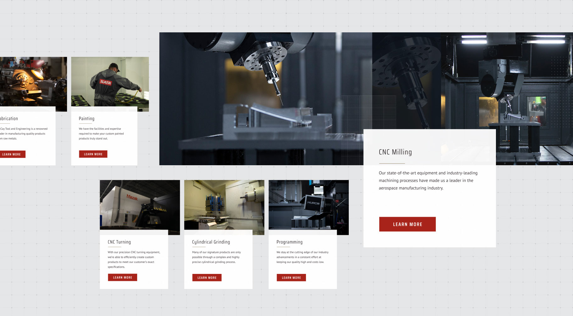
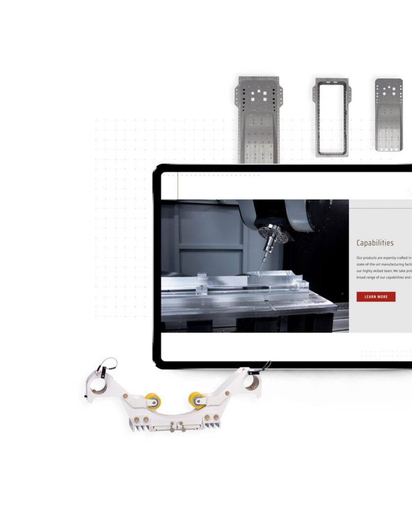
One of the client’s main goals was to have a website that users could navigate easily from any device; a site that clearly answered commonly-asked questions and that would save users from having to pick up the phone for information that should be readily available. We added a series of product and service-specific pages to highlight the client’s capabilities and presented them in an engaging fashion.
Photography (Product and Environmental)
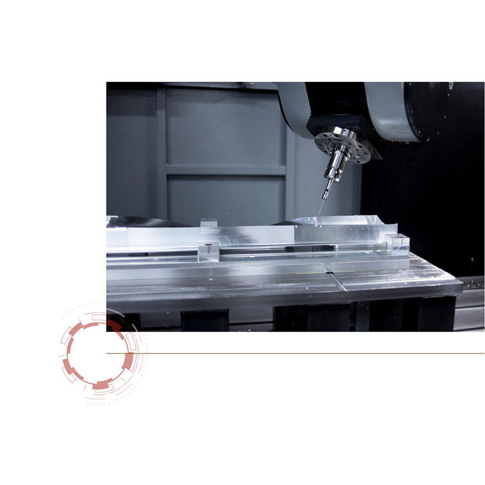
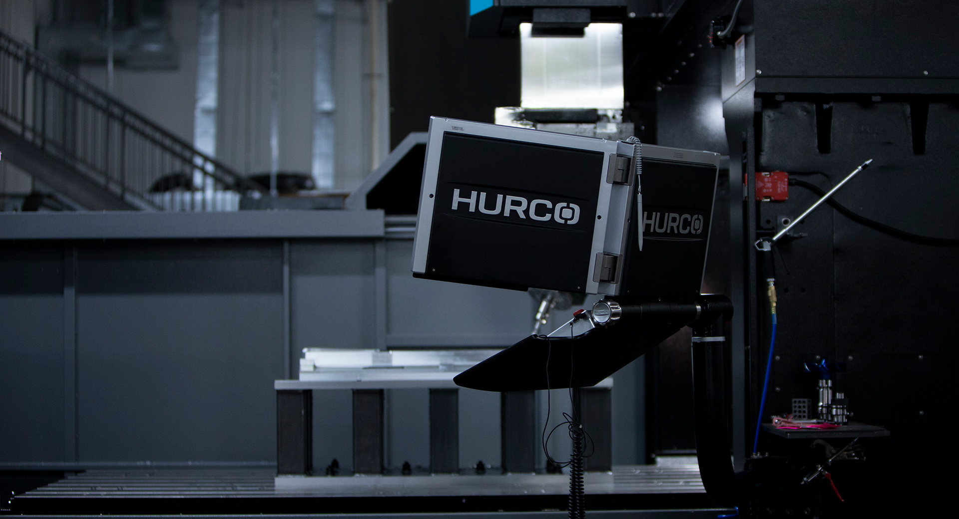
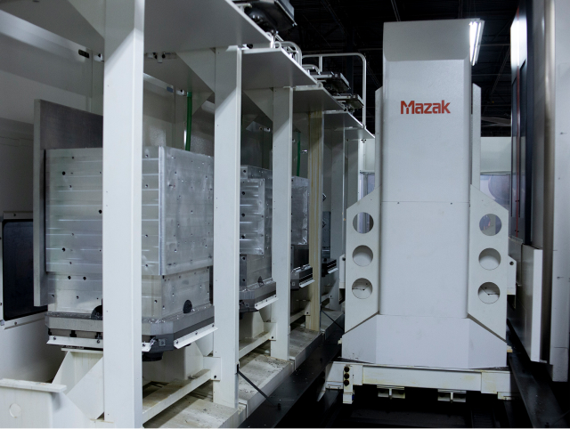
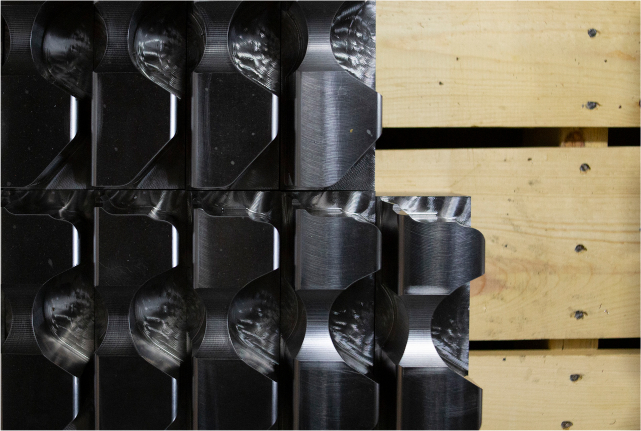
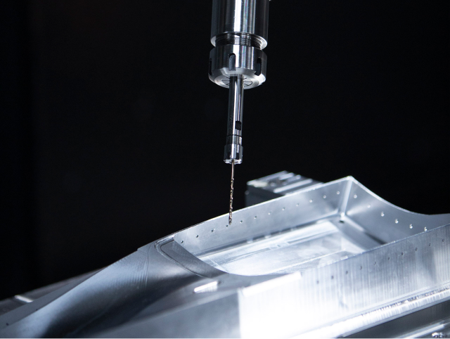
To get a behind the scenes look at what keeps the company’s systems running, our in-house photography team ventured out for a visit to McCay Tool and Engineering headquarters. The results? A rejuvenated bank of quality, custom product images and engaging environmental shots of technology in action. Our shots, especially those of features and services unique to the client, needed to convey a message and distinguish them as a trusted industry leader. Truly “worth 1,000 words”, an impactful photo has the power to instantaneously capture your audience’s attention much quicker than a block of text or stock image.
Results
Since analytics for the previous site were lacking in both details and reliability, we were limited to only the most basic of website traffic data pre-launch. However, with the information that was available, we did notice a significant increase in pageviews in the weeks and months post-launch which can be logically and largely attributed to an increase in available pages. The new site allowed viewers to access real, valuable information pertaining to exactly what they needed. In line with the client’s goal of driving inquiries to a more manageable platform (i.e. fewer phone calls), we saw a sizable increase in email and contact form submissions in a relatively short amount of time.


