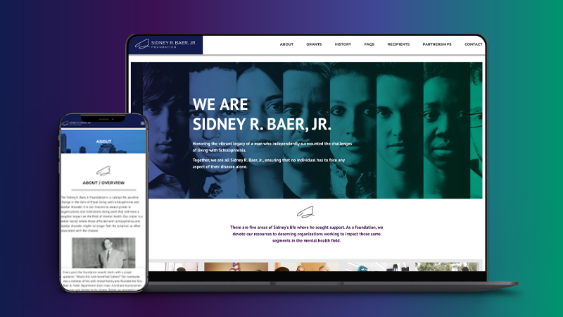
St. Louis Area Foodbank
St. Louis Area Foodbank is the region’s largest food distribution charity dedicated to feeding those in need across Missouri and Illinois. Not only do they handle the distribution of food to surrounding communities, they partner with area organizations to extend their reach to make sure everyone they serve has access to all basic necessities.
The Challenge
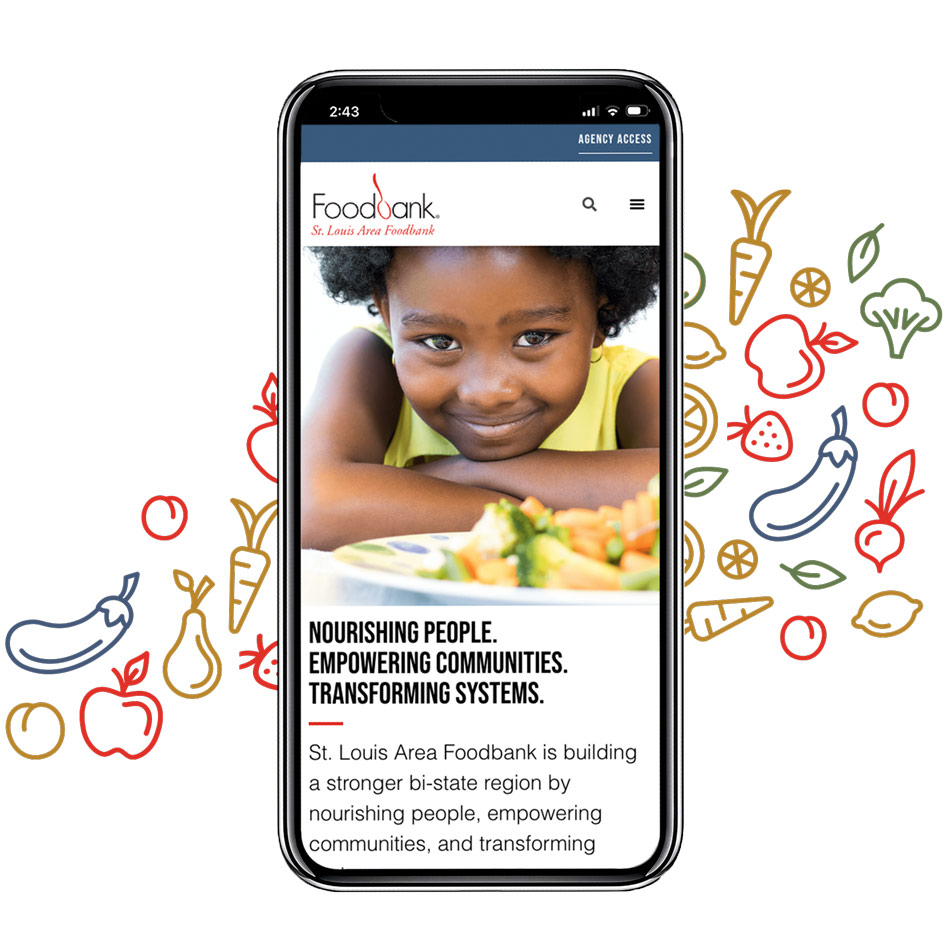
The Foodbank came to us looking for a non profit marketing agency that could help create an impactful and memorable user experience that truly showcases the mission of the St. Louis Area Foodbank. As a non-profit, it’s crucial that they speak to the neighbors they serve and their stakeholders. Their website needed to be a valuable tool to educate visitors about their mission, inspire them to act and foster ongoing participation while having intuitive, efficient development tools baked into the site’s functionality.
How TG Helped
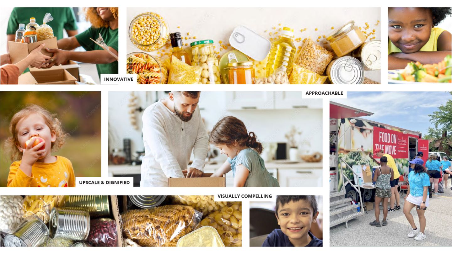
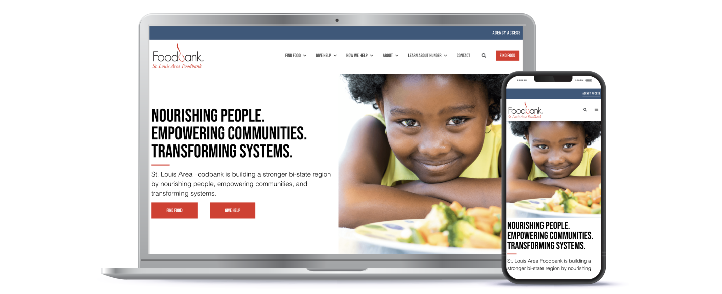
Our goal was to position Foodbank as an innovative leader in hunger relief. This project required several technical integrations, including Find Food functionality, online donations, CRM integration and an Agency Portal. Additionally, their new site needed improved ease of navigation, dignified visuals and impactful storytelling about their mission.
- Custom Development
- Content Strategy
- UX/UI
- Visual Design
Custom Development
The TG development team got to work identifying solutions and a cadence of dev functionality implementation. These findings were compiled into a Development Plan that laid out recommendations for answering the technical asks for the Foodbank’s site functionality.
Content Strategy
Their previous website was very copy-heavy and included a lot of information in disparate places. They were looking for a storytelling element to compel visitors to get involved with the mission. During the Content Planning phase, we defined the information architecture of the website build, developed the sitemap and content plan for the website, and wrote high-performing meta descriptions to ensure
UX/UI
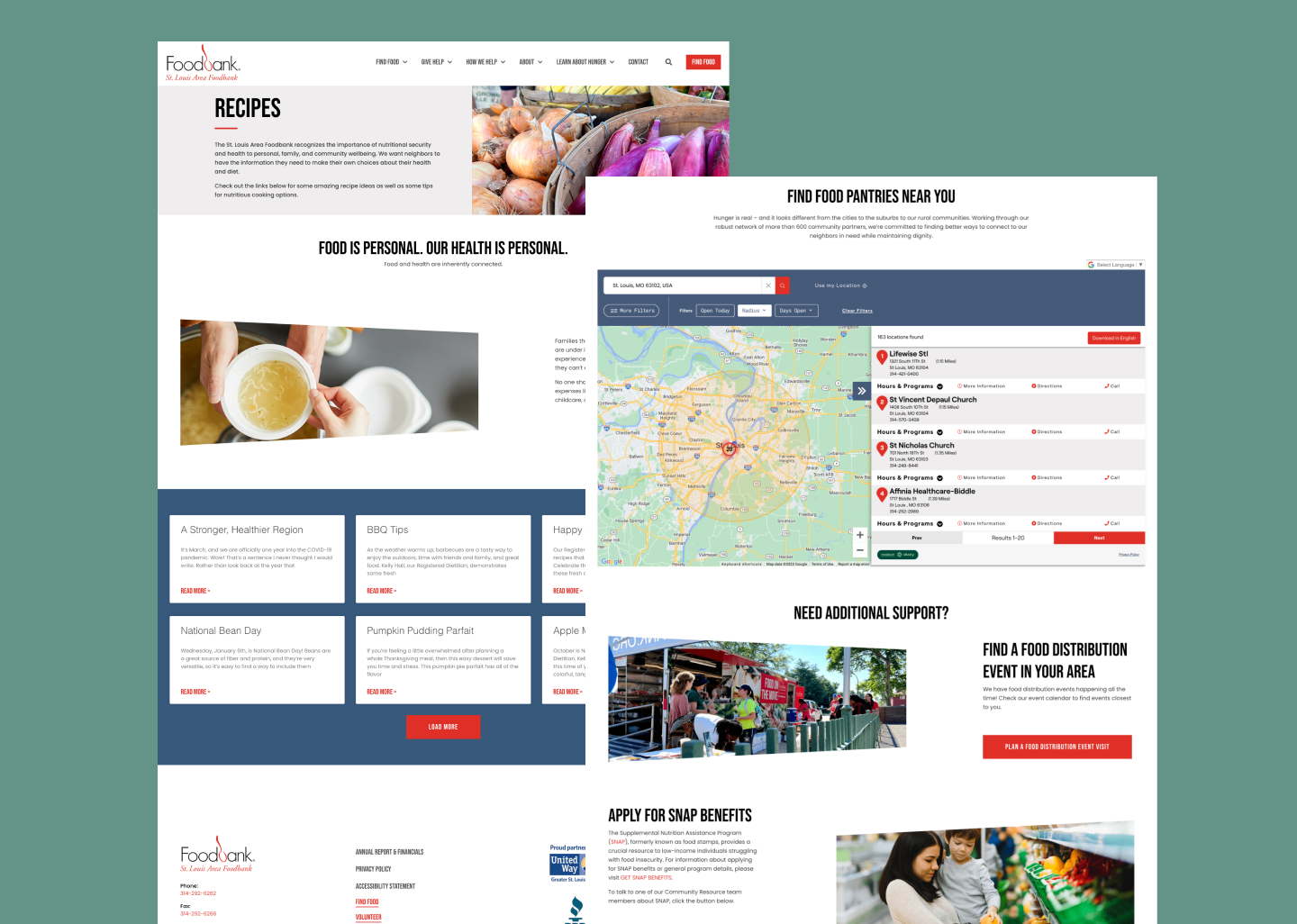
The UX/UI design was created to be approachable and easy to navigate for varying audiences while being succinct, straightforward, and intuitive. Our team defined the website elements to best suit the approved sitemap and content plan, incorporating the research we uncovered during the Content Planning phase in our selection. This exercise included a mock-up of the homepage using the chosen elements to demonstrate the website’s appearance when brand logos, colors, and content were added.
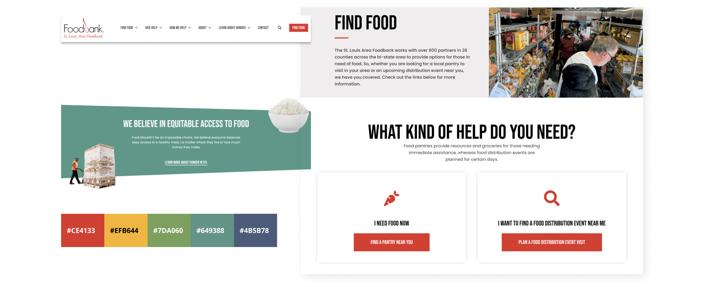
Visual Design
To create a visual direction that was innovative, visually compelling, and evoked a sense of dignity, our team leveraged the Foodbank’s current brand style guide and established a fresh, upscale look and feel to be executed across the entire site.
